Background
As Head of Development for Arena Online, I took the rebuilding of their main site very seriously. The management was confident in giving me complete creative control over both design and development. We got to work, starting with several meetings discussing goals of the site and how to acheive them.
First on the list, we needed fresh photography representing the people and culture of Arena. I followed the hired photographer around, cueing him on the framing I needed to lay things out on the new site. Individual employee shots were also taken, as well as an outdoor company-wide photo shoot out on the Salt Flats outside of Salt Lake City.
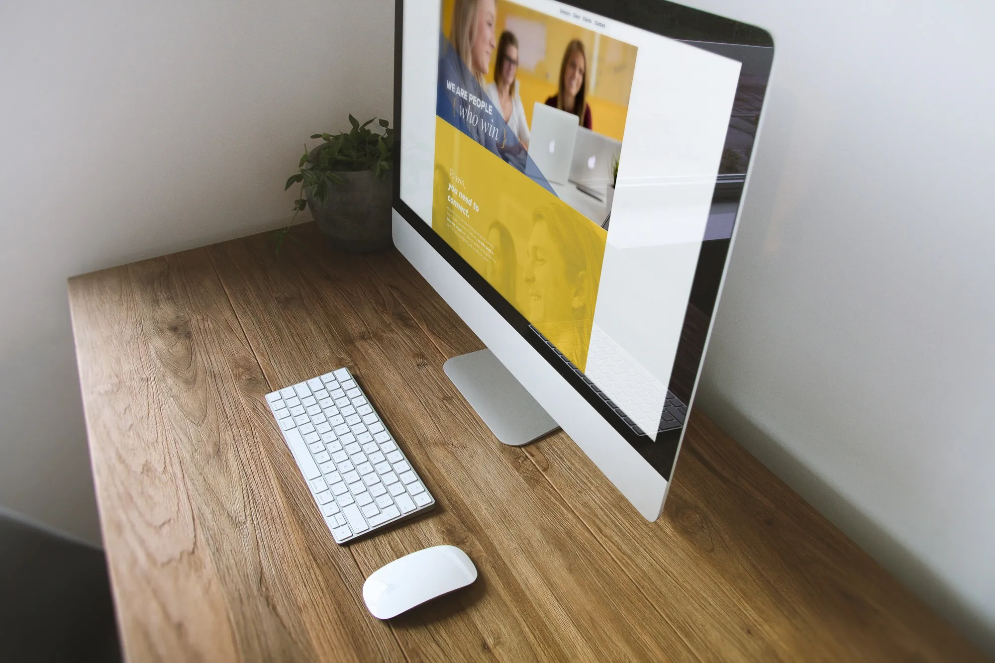
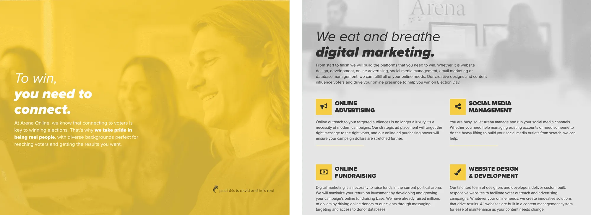
As for designing the site, I used Photoshop to lay everything out and get feedback before I got to coding. I wanted simple, bold sections describing what we do and who we are. The slideshow up top features pictures of employees smiling, helping clients, and working hard. The text in the slides illustrate our focus on clients and innovation.

After that, each section has its own main color following the branding: yellow, navy blue, and gray. These following sections provide info on our process, mentality, and our robust client list.

Conclusion
Although the entire company was watching my every move, I was confident in the choices and steps we had taken to get the final product. This is by far my best work at Arena, and I'm proud of my contribution in making the site successful in generating leads and bringing in new clientelle.

